Blog / Website maintenance
Before You Buy More Website Traffic, Test Your Contact Form
Customers might be knocking while the doorbell is disconnected. Check your website enquiry journey before paying to send more people through it.

By Zack Lekas · · 6 min read
Your website might need more visitors.
It might also need to stop losing the ones who already tried to contact you.
Before you spend another dollar on ads—or decide the entire website needs replacing—take a few minutes to test the journey from “I’m interested” to an enquiry arriving somewhere you actually check.
A shiny contact form that sends messages into the void is a very expensive suggestion box.
The quick version: Open your site on your phone, find the contact button, submit a clearly labeled test where safe to do so, and confirm it reaches the right inbox or customer-management system. Then check what happens when someone makes a mistake.
That won’t diagnose every sales problem. It will help you rule out one fairly important possibility: customers are knocking, but the doorbell isn’t connected.
This is a practical supporting checklist for the Small Business Website Guide.
In this guide
- Start where a customer would start
- Fill it out like a normal human
- Follow a test enquiry all the way through
- Make a mistake on purpose
- Explain what happens next
- Keep the customer’s context
- Measure actual enquiries
- Use the quick checklist
1. Start where a customer would start
Open a service page on your phone.
Not the admin dashboard. Not the contact page you already know by heart. Start with the page someone might find while searching for what you do.
Can you quickly tell:
- What the business offers?
- Whether it serves your area?
- Which button starts an enquiry?
- Whether you’re requesting a quote, asking a question, or booking an actual appointment?
“Submit” describes a computer task. “Request a repair quote” tells a person what they’re doing.
You don’t need every button to deliver a motivational speech. A little clarity will do.
Also check the phone number. Tap it and confirm it opens the correct number in your phone’s dialler. You can cancel before placing the call.
2. Fill it out like a normal, slightly distracted human
Use your actual phone. Leave the television on if you want a realistic testing environment.
Check whether:
- The text is readable without zooming.
- Fields have clear labels.
- Required and optional information are distinguishable.
- The keyboard doesn’t hide the next step.
- Your answers survive a small mistake.
- The form asks questions you can reasonably answer.
A customer requesting a deck estimate may know roughly what they want. They may not know the timber species, footing details, or their personal philosophy on joist spacing.
Ask for what you need to assess the enquiry. Save detailed project questions for the appropriate stage.
W3C’s forms guidance recommends simple forms that request only information needed for the process, with properly associated labels.
That doesn’t mean “the fewest fields always wins.” A service-area question might save both parties a wasted conversation. Every question should have a job.
3. Send a test—and follow it all the way through
Use an email address you control. Start the message with:
TEST ENQUIRY — checking the website form. No customer follow-up needed.
If the form triggers bookings, payments, or automated customer messages, use its test environment or coordinate with whoever manages it first.
For an ordinary enquiry form, check the whole journey:
| Checkpoint | What you’re looking for |
|---|---|
| Website | A clear result after submission |
| Business inbox | The enquiry arrives at the intended address |
| Spam folder | The message hasn’t been diverted |
| CRM or booking system | A record appears, if that connection is part of the setup |
| Message contents | Contact details and enquiry text are complete |
| Reply | You can respond to the customer’s supplied address |
| Customer acknowledgement | Any promised confirmation arrives and explains the next step |
A green tick on the website is encouraging. It isn’t proof that the message reached your team.
If it doesn’t arrive, check the form’s delivery records, recipient settings, spam filtering, and connected services. Depending on the setup, the problem could be in the form, the email delivery service, or the integration between them.
Replacing the homepage photo is unlikely to repair that particular situation.
4. Make a mistake on purpose
Leave a required field empty. Enter an incomplete email address. Try reaching the fields and submit button using the Tab key on a computer.
You’re looking for useful feedback:
- Does the form explain what needs correcting?
- Is the problem connected to the relevant field?
- Does it preserve the information you already entered?
- Can you continue without starting again?
“Something went wrong” is technically a sentence. It is rarely a helpful instruction.
W3C recommends clear feedback that helps people identify and correct errors. A quick keyboard check is useful, but it isn’t a complete accessibility audit.
5. Tell people what happens next
After sending an enquiry, customers shouldn’t have to wonder whether they have sent a message, requested an appointment, reserved a time, or confirmed a booking.
Those are different things.
If someone still needs to review the request, say so. If you normally reply within a particular period, publish an expectation you can reliably meet.
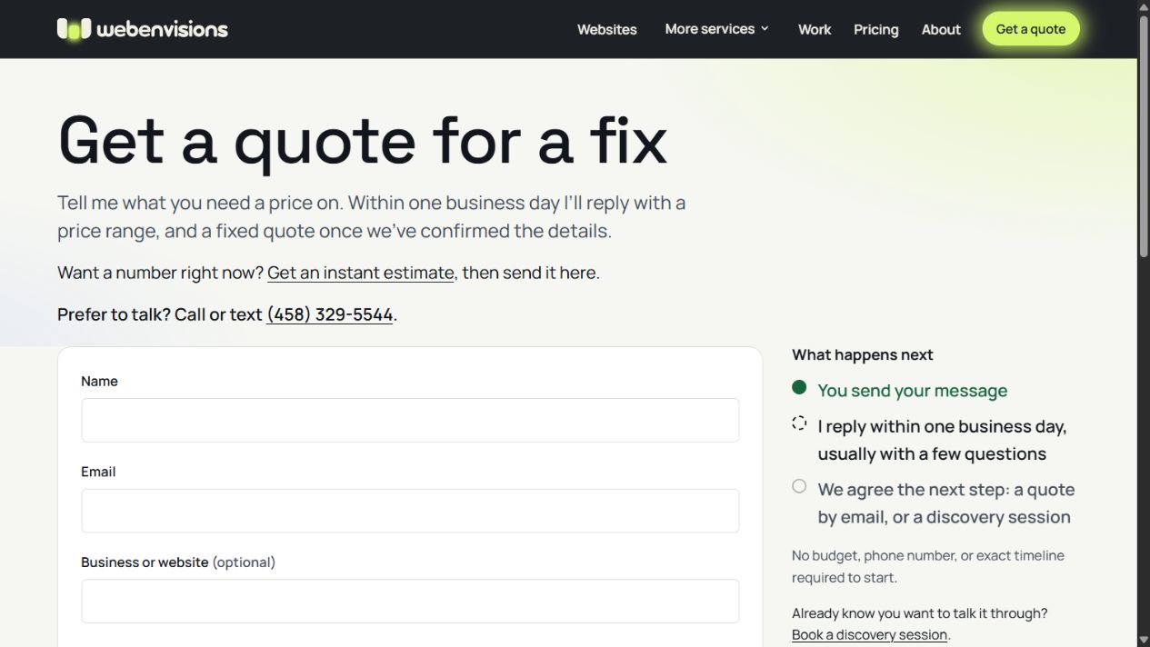
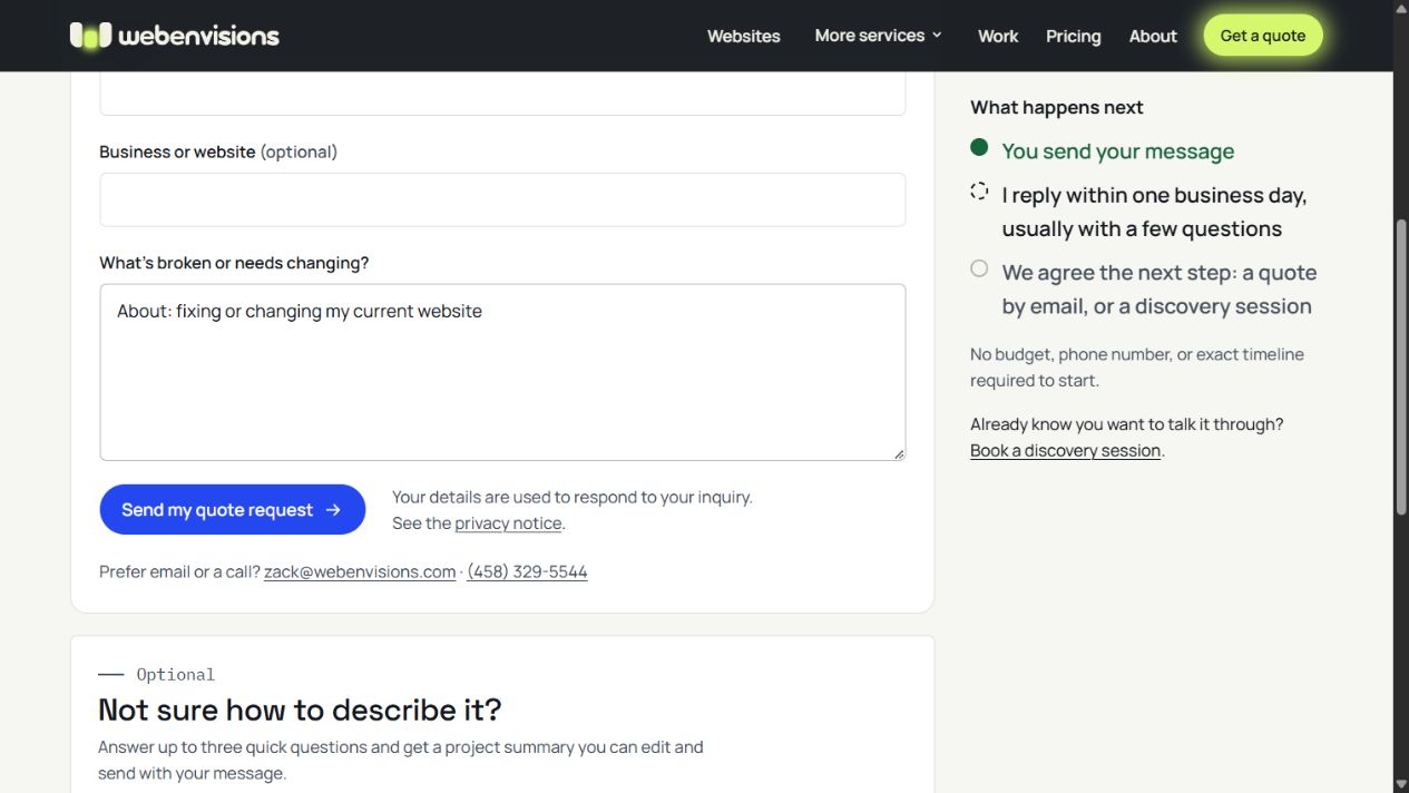
On Web Envisions, the website-repair enquiry link opens a form headed “Get a quote for a fix.” It asks what’s broken or needs changing and includes a “What happens next” explanation. The screenshot at the top of this article shows that live page.
Those are things you can inspect on the page. Whether the enquiry reaches the business still needs its own delivery test.
6. Don’t make customers explain everything twice
Imagine choosing a service, answering a few questions, and clicking “Get a quote.”
The next page asks: “What can we help you with?”
The website has developed sudden amnesia.
Where practical, carry the selected service or project details into the enquiry. Let the customer review and change them.
A simple form may be enough. More complicated choices might benefit from a guided request. My article on intelligent UI and helping visitors take the next step explains that approach in more detail.
The goal is a clearer enquiry, not an obstacle course with better typography.
7. Measure enquiries, not just button clicks
Someone clicking “Contact” is useful information. Someone completing an enquiry is a different result.
If you use Google Analytics, its recommended generate_lead event is intended for lead generation, such as a completed enquiry. The implementation needs to match the actual successful action—not simply a click on the send button.
Then look beyond the total.
Are those enquiries suitable? Are they from the right area? Do they contain enough information to answer? How many turn into useful conversations?
Twenty messages asking for a service you don’t offer are still twenty messages you have to answer.
Keep customer names, email addresses, and message contents out of analytics events.
Your quick contact-form checklist
- Start from a service page on your phone.
- Find and understand the enquiry action.
- Check labels, required fields, and mobile usability.
- Submit a clearly labeled test where safe to do so.
- Confirm receipt in the intended inbox or system.
- Check the enquiry details and reply address.
- Test an error and confirm your answers remain.
- Read the confirmation from the customer’s perspective.
- Check that enquiries reach someone responsible for replying.
Repeat after changes to the form, email setup, website platform, or connected tools. Add a recurring check that fits how important enquiries are to your business.
Broken form—or bigger website problem?
A failed form doesn’t automatically mean you need a new website. It may need a contained repair or an integration fixed.
If the enquiry journey works but suitable customers still aren’t contacting you, investigate the offer, service information, traffic quality, pricing expectations, and evidence of your work.
For the bigger picture, start with the Small Business Website Guide.
And if something is broken, slow, or refusing to talk to something else, see website repairs and improvements.
Tell me the page address, what you expected to happen, and what happened instead. That gives us a better starting point than “the internet is being weird,” although I respect the diagnosis.
All postsNext: How Do I Increase My SEO? A Practical Guide for Small Businesses